UX/UI DESIGN
getbetter App
Chronic Disease Management in Patient Hands
About
Industry
Healthcare
Role
UX/UI Designer (solo)
Duration
4 months
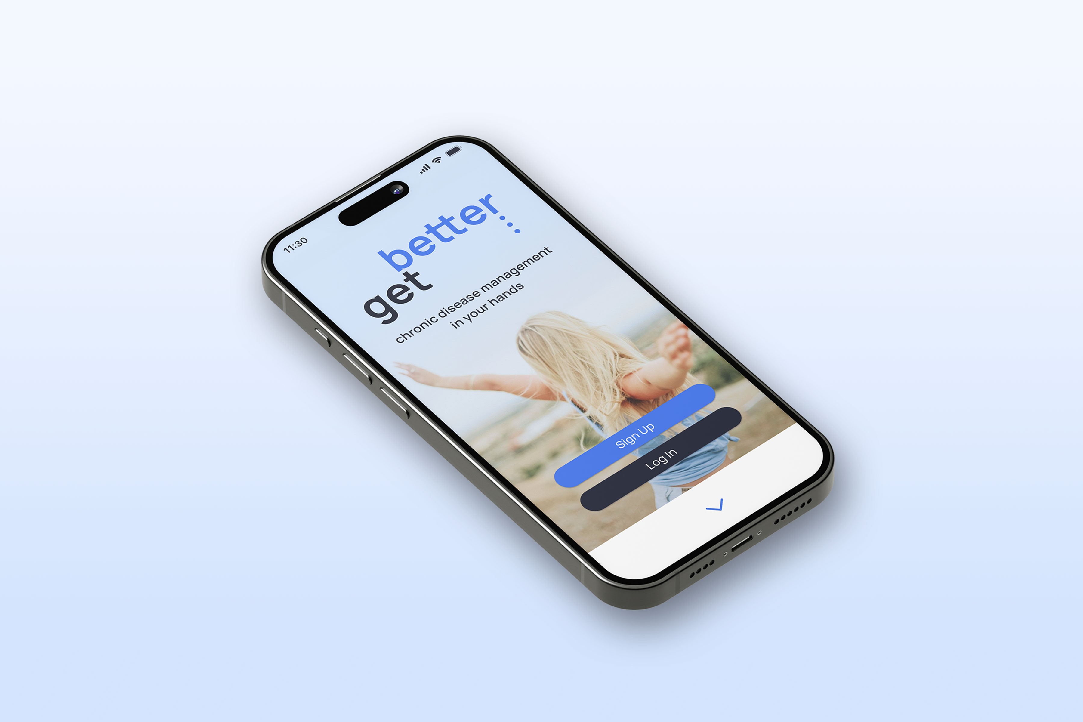
The daily life of patients with chronic conditions comes with numerous organizational challenges, from appointment management and medication tracking to documenting well-being. The getbetter app aims to provide a centralized platform to gather all relevant information related to the illness, helping patients maintain an overview and make living with a chronic illness a bit easier.
I followed a systematic approach covering the entire user-centered design process, resulting in a finalized prototype and comprehensive design documentation. To conclude, I reflected on my process, identified key learnings, and considered potential next steps.
Design Process
Understand
Problem Statement
Individuals with chronic illnesses struggle to maintain a consistent medication schedule and symptom monitoring due to unpredictable routines and the demands of their condition. Developing healthy habits amidst the stress of everyday life can be a significant challenge. The app’s success is indicated when patients manage their appointments, take medications consistently, track their symptoms, and connect with others facing similar challenges to learn from each other. In essence, when they feel in control of their condition and experience an improved quality of life.
Competitive Analysis
MIKA App
(for cancer patients)

Analyzing their strengths, opportunities, and weaknesses in user experience provided valuable insights and helped in defining sustainable competitive advantages for my web app.
UX Analysis
Afterward, I continued with UX analysis. I compared both apps, addressing specific strengths and weaknesses in their overall user experience, and the provided features.
Observe
User Research
Research Goals
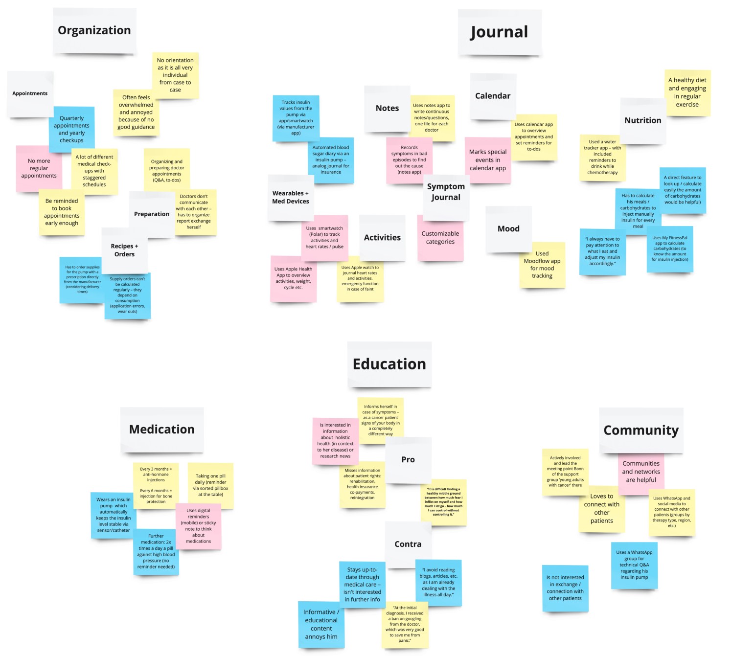
Identification of difficulties associated with managing a life with chronic disease
Better understanding of the needs and behaviors of chronically ill people
Determination of tasks users would like to complete using the health tracking app
Documentation of user pain points with existing health apps available in the market
Collection of data on the context in which users would use the health app
Exploration of privacy concerns related to the use of health apps
Key Insights & User Needs
Point of View
User Personas
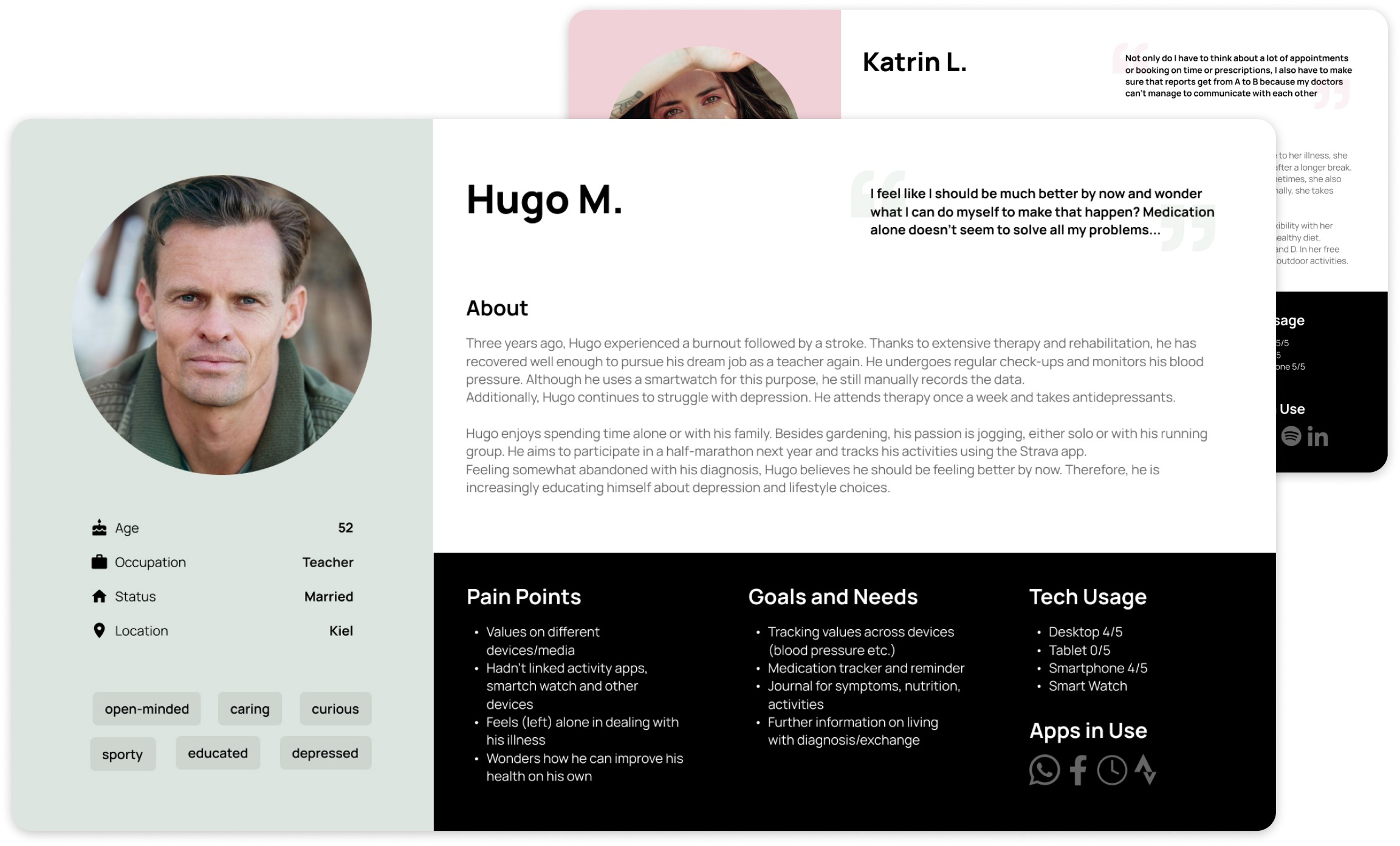
Based on insights from the user research phase regarding needs, frustrations, and goals, I stepped into the users’ perspective and created two primary personas.
Ideate
User Journey Maps
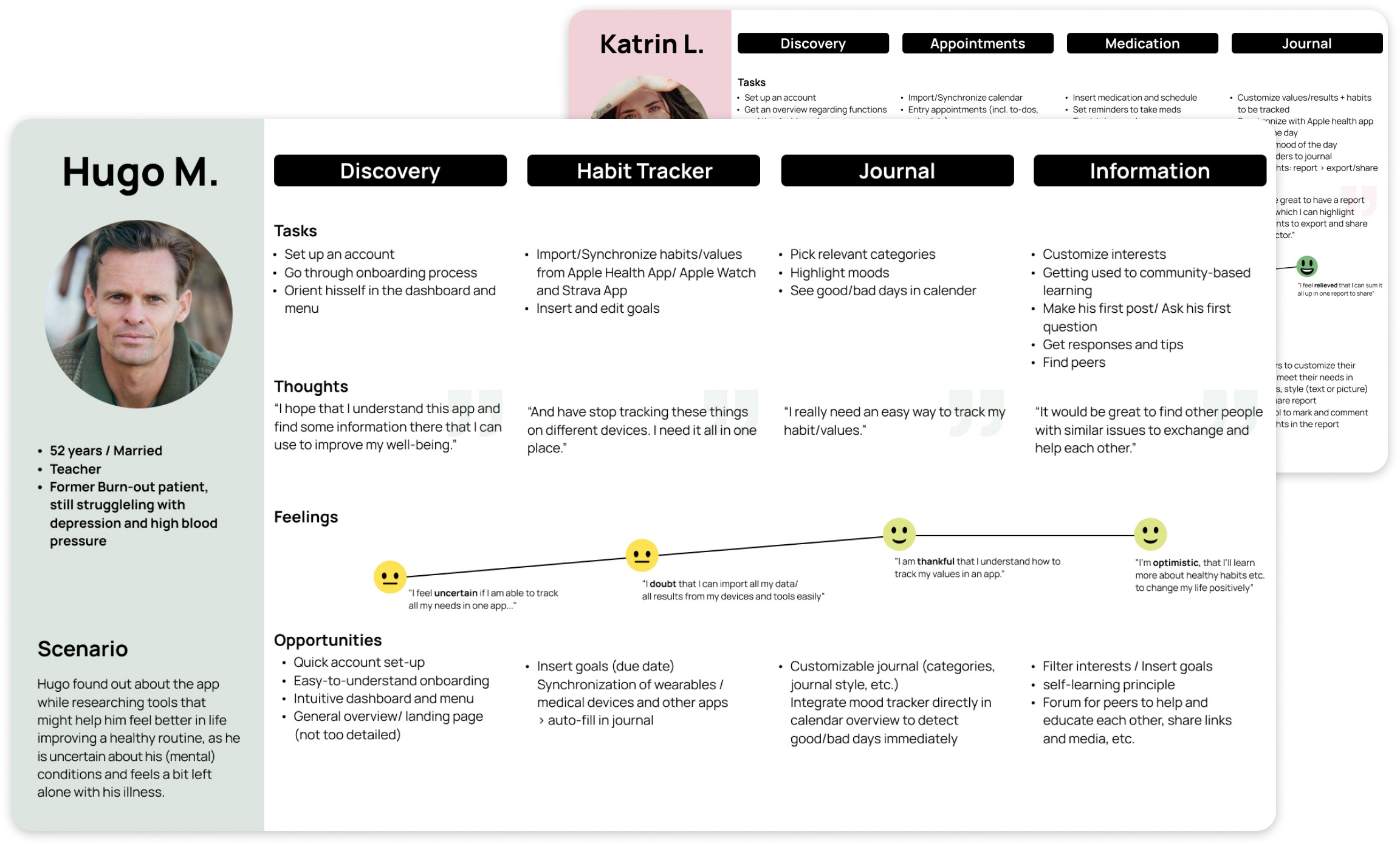
Besides individual user goals, I've developed user journey maps to visualize my persona's stories, point out their needs, thoughts, and feelings, and create opportunities for my web app to serve.
Task Analysis & User Flows
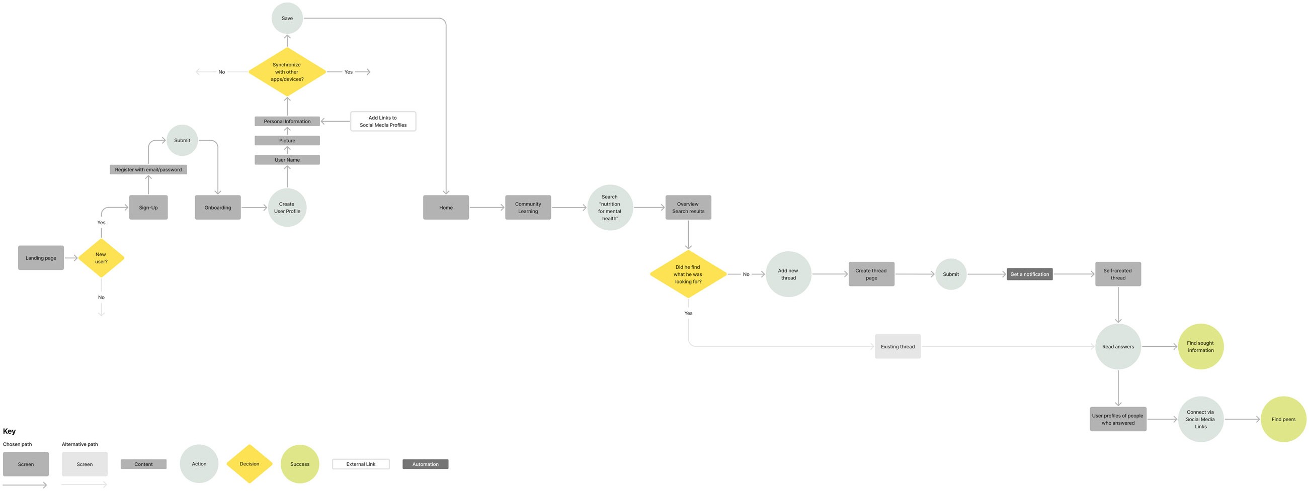
Based on this, I created user flows that outline each persona's journey within the app to achieve their specific goals. The focus was on the individual steps and user decisions in the context of the previously defined task.
User Flows
Katrin: Quick signup —> Save appointment in calendar
Katrin: Login —> Customize journal and save daily entry
Hugo: Signup —> Find information + Bonus: Find peers
User Flow 3: Hugo: Signup -> Find information + Bonus: Find peers
Information Architecture
After creating the initial sitemap, I conducted a card sorting analysis to check the structure and organization of the content. The results helped me improve the second version of the sitemap. It will evolve and improve alongside the user flows during the iterative design process.
Prototype
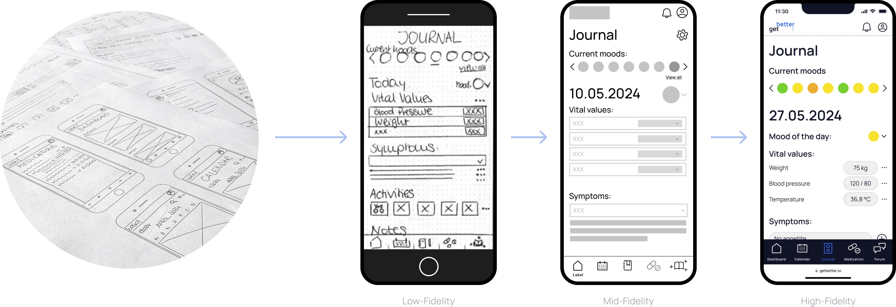
Wireframes & Prototypes
Based on the sitemap and user flows, I developed prototypes from low- to high-fidelity levels to refine the key user flows and the five core features:
Five Key Features
Test
Usability Testing
Objectives
Assess if participants quickly grasp the purpose and value of the app
Observe how users navigate different features and find information easily
Identify any usability issues that hinder user experience
Determine if users find what they need and effectively use the provided tools (calendar, journal, medication tracker, and forum)
Issues + Solutions
Preference Tests
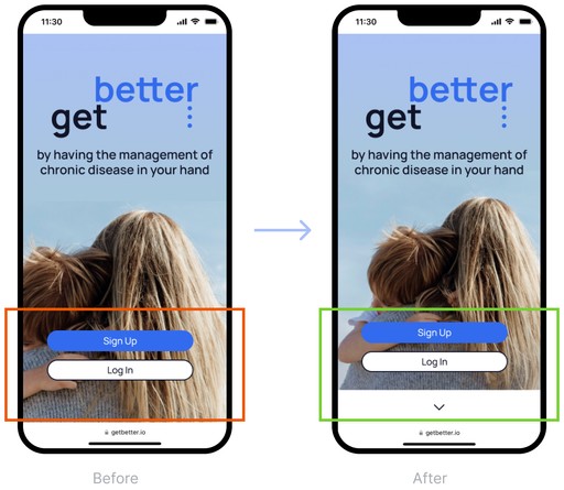
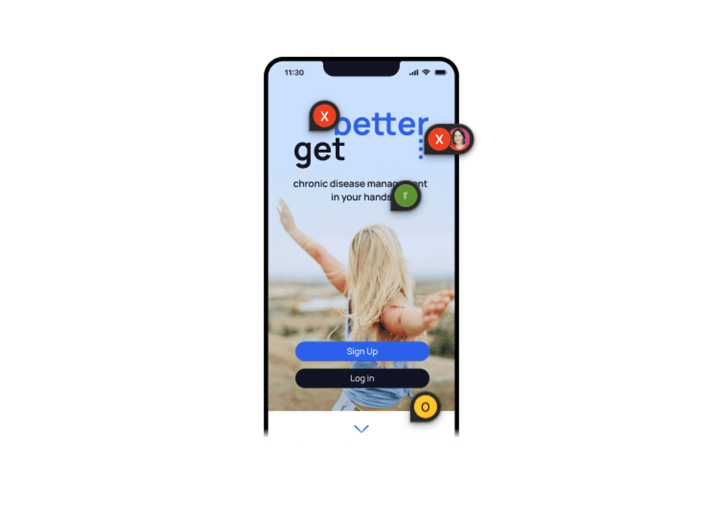
Concluding, using A/B tests, I checked potential changes, such as a more positive and engaging title image (addressing negative comments from user testing) or improving the overall dashboard look for clarity.
Iterate
Iterative Design Loops
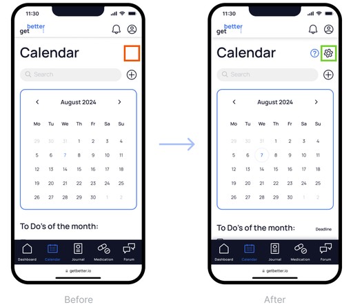
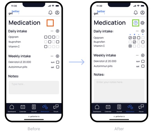
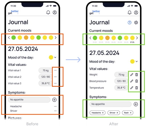
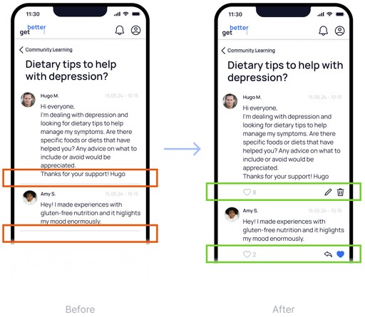
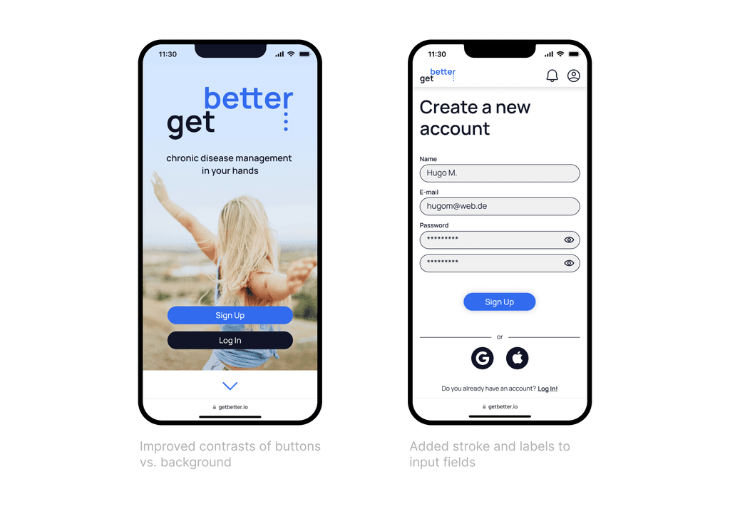
Through A/B testing, I evaluated potential improvements such as a more engaging cover image and a clearer dashboard layout to address negative feedback from usability tests. In iterative design loops, I continuously optimized the prototype and its underlying design system. My focus was on two key aspects that are crucial in the medical context to motivate patients for regular use: accessibility and emotional design to foster motivation and engagement.
Accessibility
Emotional Design
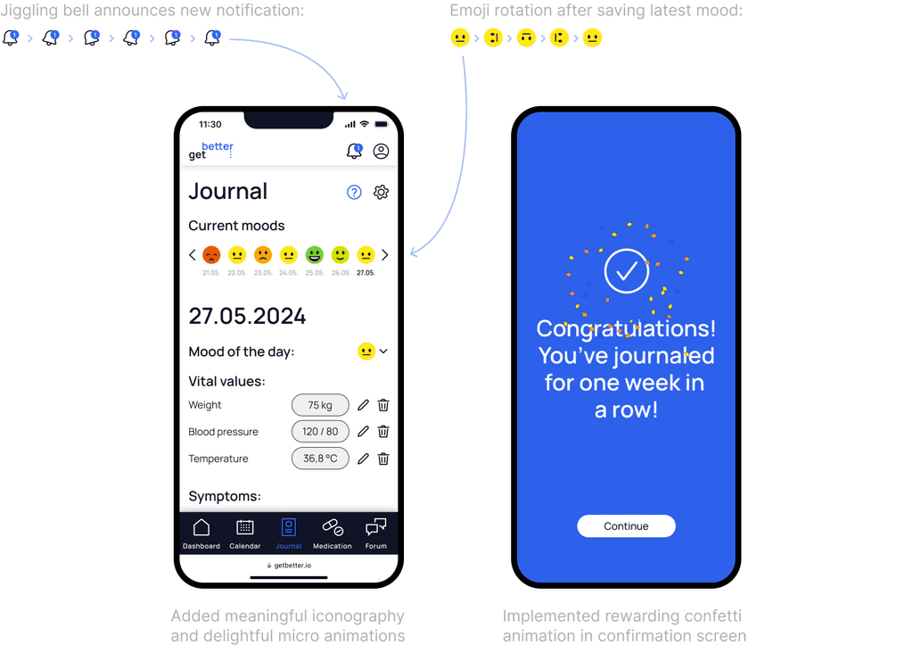
In order to keep users engaged and motivated, I focused on creating a positive and professional look to establish the app's personality. This included:
Using icons and meaningful emotional visuals (such as a strategic color scale linked to emojis)
Implementing delightful micro animations to make users remember and enjoy the app through positive stimuli
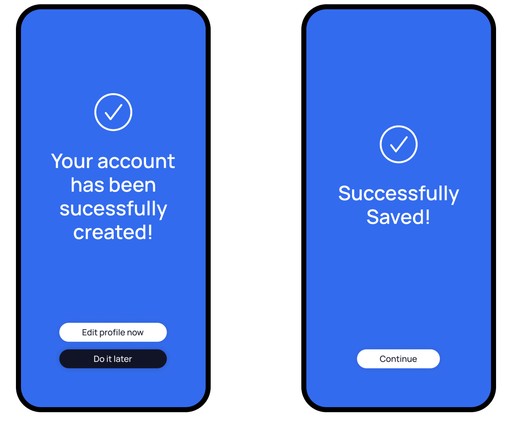
Rewarding the user with a motivational confetti animation after successfully journaling and interacting with the app for one week in a row.
Collaboration
Finalize
After multiple iterations and refinements, I developed a validated high-fidelity prototype that meets user needs. It is supported by a design system to facilitate future development.
Design Documentation
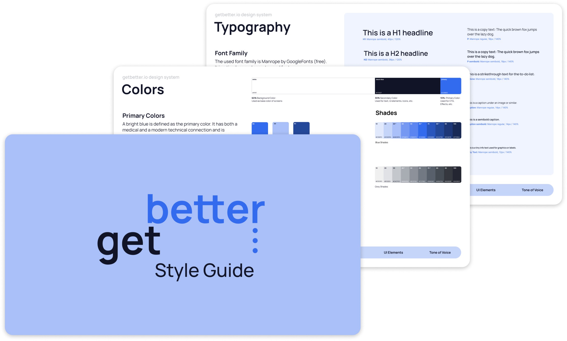
I created the brand's UI and presented it in the style guidelines, which included the logo, colors, typography, iconography, imagery, grid, and tone of voice. All UI elements are available in a library for fast and seamless future development and collaboration.
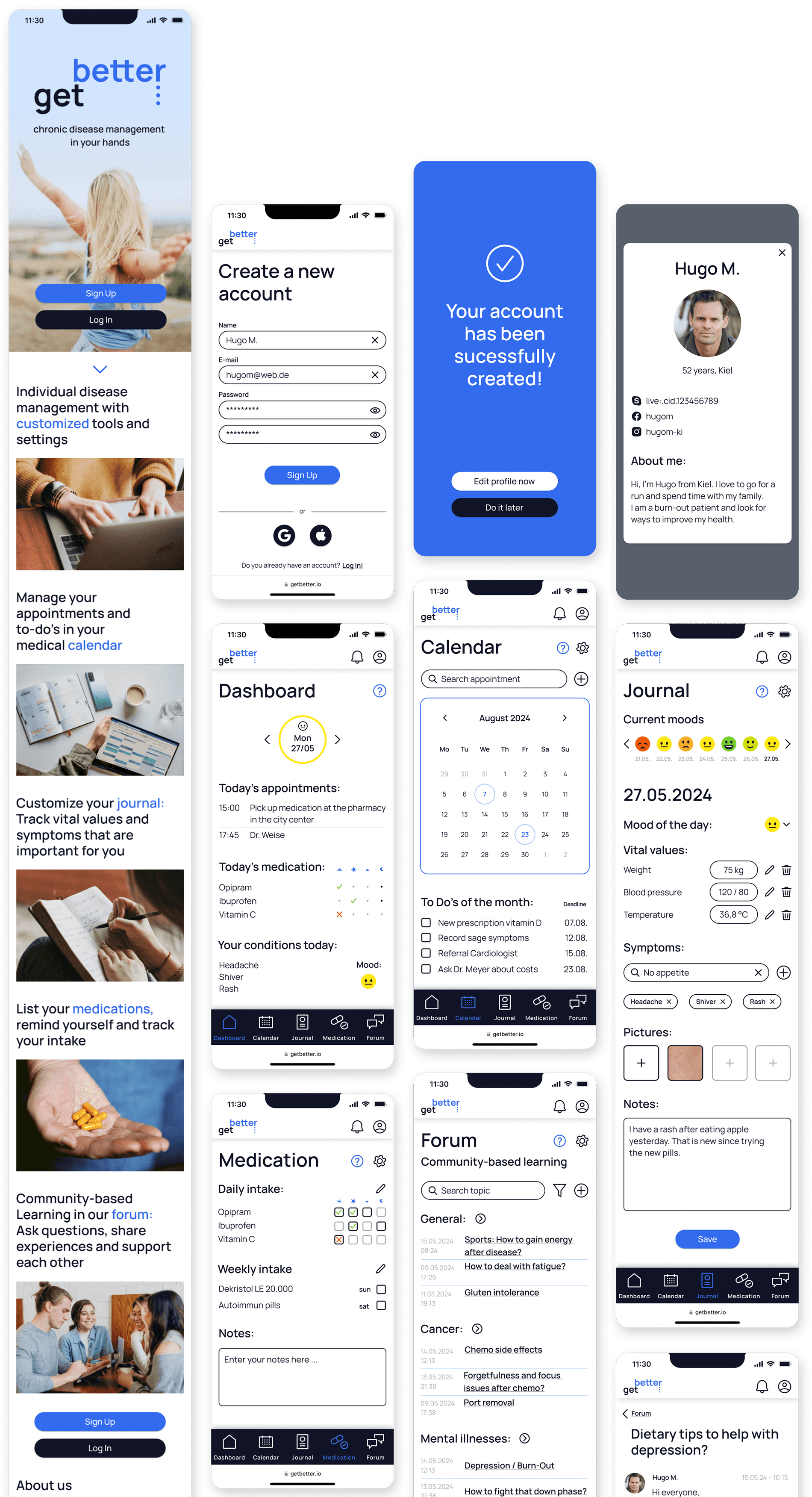
Final Prototype
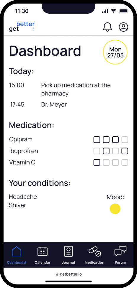
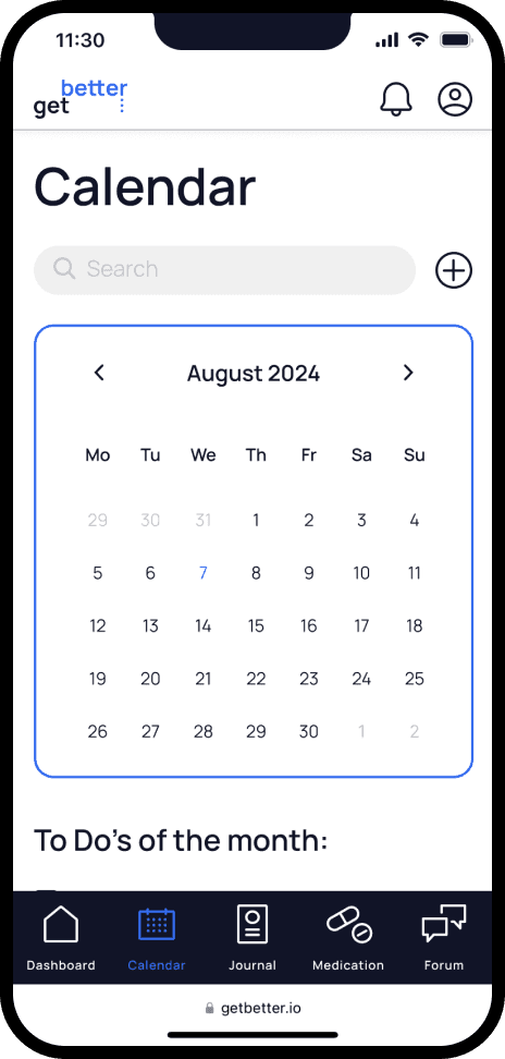
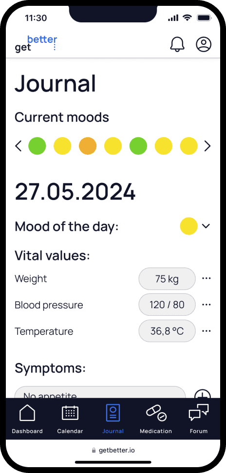
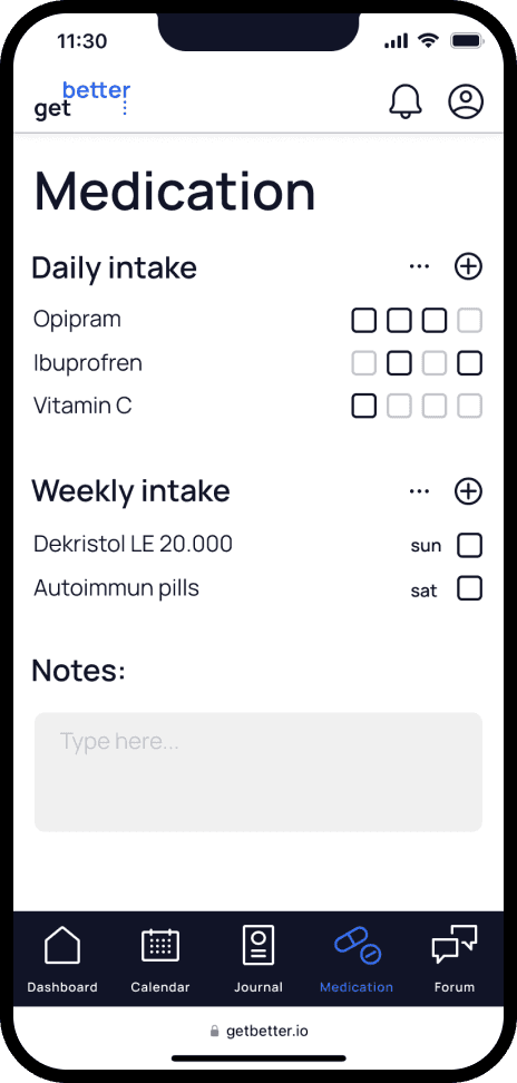
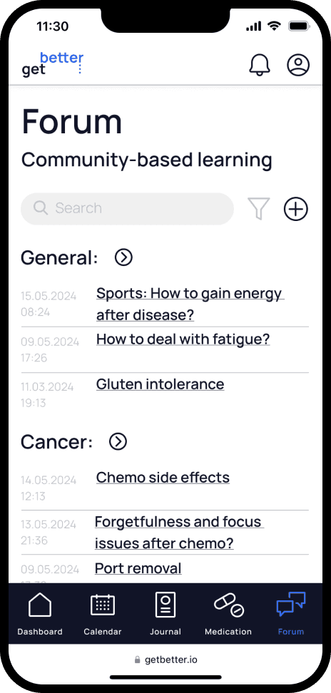
After all the iterations and improvements, here are impressions of some high-fidelity screens.
Takeaways
The project enhanced my skills in user research, wireframing, prototyping, usability testing, and UI design. It highlighted the importance of deeply understanding the user, iterative design, and usability testing, as well as the attention to UI details, particularly in creating accessible and intuitive interfaces. These experiences and the acquired problem-solving skills provided a comprehensive understanding of user-centered design and the ability to serve a complex disease management web app.
